Project Mandate: Transforming the Audio Guide Experience
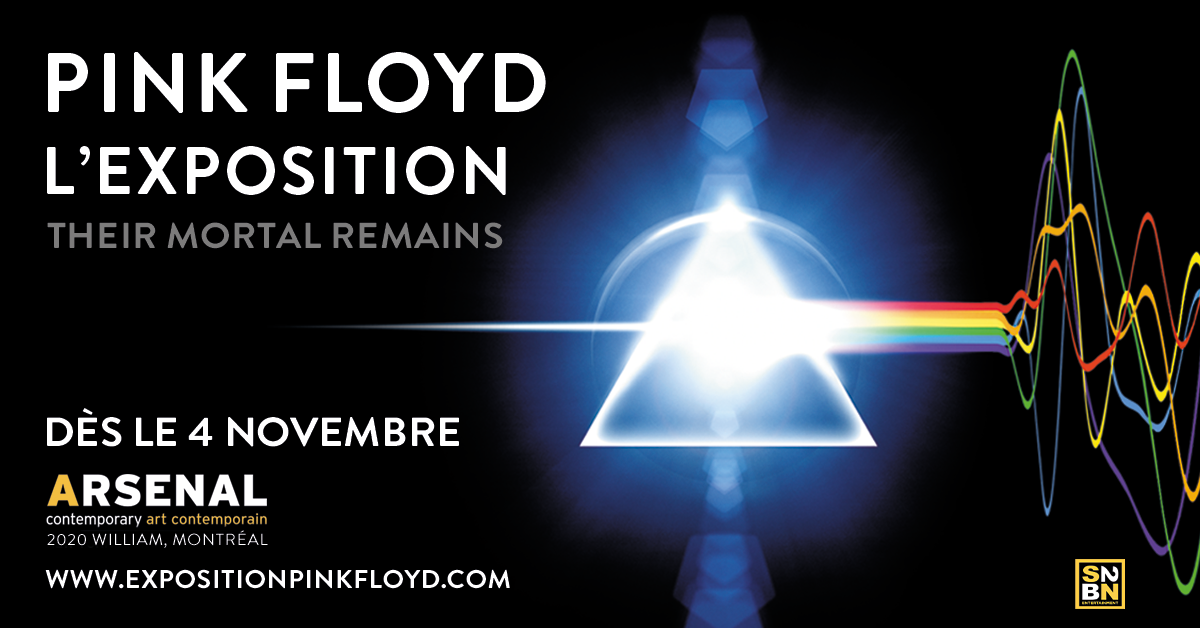
Our mandate for the Pink Floyd: Their Mortal Remains exhibition was clear and ambitious: enhance the overall visitor experience and eliminate all pain points associated with audio guide experiences. This directive shaped every aspect of our technological integration strategy.
Add your title here. It should be a summary of what the section is all about. Use it to attract users so they continue reading.
This is the text area for this paragraph. To change it, simply click and start typing. Once you've added your content, you can customize its design by using different colors, fonts, font sizes and bullets. Just highlight the words you want to design and choose from the various options in the text editing bar.
This is the text area for this paragraph. To change it, simply click and start typing. After adding your content, you can customize it.
This is a text area for this paragraph. To change it, simply click and start typing. Once you added your content, you can customize its design by using different colors, fonts, font sizes and bullets. Just highlight the words you want to design and choose from the various options in the text editing bar.
This is a text area for this paragraph. To change it, simply click and start typing. After adding your content, you can customize it.
AUDIO GUIDES
This is the text area for this paragraph. To change it, simply click and start typing. Once you've added your content, you can customize its design.
Women's health at Every stage
For this project, we designed a landing page for a telehealth practice to introduce their new women’s health services. Before colors, visuals, and polish, we focused on layout, hierarchy, and the user journey to ensure every section had a purpose.